MVVM 的三个部分
让我们看一下MVVM的三个部分:模型,视图和视图模型。
视图:这些都是UI元素,是应用程序的漂亮面孔。对于WPF,这些都是您的所有XAML文件。它们可能是Windows,用户控件或资源字典。尽管完全可以从代码构造视图当然是可能的,但绝大多数UI将(并且应该)使用XAML构建。该视图可能非常动态,甚至可以处理一些用户交互(请参见下面的“命令”部分)。
视图模型:这些是为每个视图提供数据和功能的对象。通常,视图和视图模型类之间通常存在一对一的映射。视图模型类,将数据公开给视图,并提供处理用户交互的命令。与其他设计模式不同,视图模型不应该知道其视图。关注点的分离是MVVM的主要宗旨之一。视图模型是视图和模型之间的连接。
模型:从广义上讲,模型提供对应用程序所需数据和服务的访问。根据您的应用程序,这是完成实际工作的地方。虽然视图模型与将模型的数据汇总在一起有关,但是模型类执行应用程序的实际工作。如果使用依赖项注入,则通常在视图模型中将模型类作为接口构造函数参数传递。
由于视图模型与模型之间的交互将在很大程度上取决于您的特定应用程序,因此在本文的其余部分中,我们将仅着眼于视图与视图模型之间的交互。
Bidding
绑定引擎使MVVM模式成为可能。绑定在视图中声明,并将视图中的属性链接回视图模型中的属性。
public class ViewModel
{
    public string FirstName { get; set; }
}
<TextBlock Text="{Binding Path=FirstName}" VerticalAlignment="Center" HorizontalAlignment="Center"/>上面的代码是实现MVVM模式的开始。绑定将Text属性的值设置为FirstName属性中的值。如果要运行此代码,则TextBlock的Text仍为空。这是因为没有将ViewModel类链接到Window的东西。在WPF中,此链接来自DataContext属性。
在Window的构造函数中,我们将设置其DataContext。如果在UI元素上未指定DataContext,它将继承其父级的DataContext。因此,在Window上设置DataContext将有效地为Window中的每个元素设置它。
public MainWindow()
{
    var viewModel = new ViewModel();
    viewModel.FirstName = "Kevin";

    DataContext = viewModel;
    InitializeComponent();

    viewModel.FirstName = "Mark";
}
如果我们运行应用程序,TextBox 仍将显示“ Kevin”,而不是更新后的值“ Mark”。虽然属性的值已经更改,但是没有通知 Binding 更新其值。我们可以通过实现 INotifyPropertyChanged (INPC)接口来解决这个问题。此接口有一个事件,通知绑定,特定属性已更改,使用该事件的任何绑定都应重新计算其值。
我们可以这样实现它:
public class ViewModel : INotifyPropertyChanged
{
    public event PropertyChangedEventHandler PropertyChanged;

    public string FirstName { get; set; }

    public void OnPropertyChanged(string propertyName) => PropertyChanged?.Invoke(this, new PropertyChangedEventArgs(propertyName));
现在,在 Window 的构造函数中,我们通知视图该属性已更改。
public MainWindow()
{
    var viewModel = new ViewModel();
    viewModel.FirstName = "Kevin";

    DataContext = viewModel;
    InitializeComponent();

    viewModel.FirstName = "Mark";
    viewModel.OnPropertyChanged(nameof(ViewModel.FirstName));
}
现在绑定正确地更新以显示“ Mark”。
但是,每次更改属性值时都要记住引发该事件可能会变得非常乏味。因为这种模式非常普遍,许多 MVVM 框架为你的视图模型类提供了一个基类,类似于下面这样:
public abstract class ViewModelBase : INotifyPropertyChanged
{
    public event PropertyChangedEventHandler PropertyChanged;

    protected bool SetProperty<T>(ref T field, T newValue, [CallerMemberName]string propertyName = null)
    {
        if(!EqualityComparer<T>.Default.Equals(field, newValue))
        {
            field = newValue;
            PropertyChanged?.Invoke(this, new PropertyChangedEventArgs(propertyName));
            return true;
        }
        return false;
    }
}
这使我们可以像这样重写FirstName属性:
public class ViewModel : ViewModelBase
{
    private string _firstName;
    public string FirstName
    {
        get => _firstName;
        set => SetProperty(ref _firstName, value);
    }
}
Command
绑定是将数据从视图模型移入视图的一种好方法,但是我们还需要允许我们的视图模型响应用户交互。大多数具有默认用户交互功能(例如单击按钮)的用户控件均由命令处理。所有实现ICommandSource接口的用户控件都支持Command属性,当控件的默认操作发生时,该属性将被调用。有许多实现此接口的控件,例如按钮,菜单项,复选框,单选按钮,超链接等。
命令只是实现ICommand接口的对象。或者换一种说法,命令是从视图到视图模型的消息。当控件的默认事件发生时,例如单击按钮时,将调用命令上的Execute方法。更重要的是,命令还可以指示它们何时能够执行。这允许控件根据是否可以执行其命令来启用或禁用自身。
命令示例
从我们非常简单的示例中可以看出,单击按钮时,我们会更改名字的值。
首先,我们需要在视图模型中添加一个command属性:
public class ViewModel : ViewModelBase
{
    public ICommand ChangeNameCommand { get; }
    ...
}
接下来,我们将向MainWindow添加一个按钮,并使用Binding将其Command属性设置为视图模型中的命令。
<Button Content="Change Name" Command="{Binding Path=ChangeNameCommand}" VerticalAlignment="Bottom" HorizontalAlignment="Center" />现在,我们只需要向视图模型中的ChangeNameCommand属性分配一个新的命令对象即可。不幸的是,WPF没有附带适合在视图模型中使用的默认ICommand实现,但是该接口非常简单,可以实现:
public class DelegateCommand : ICommand
{
    private readonly Action<object> _executeAction;

    public DelegateCommand(Action<object> executeAction)
    {
        _executeAction = executeAction;
    }

    public void Execute(object parameter) => _executeAction(parameter);

    public bool CanExecute(object parameter) => true;

    public event EventHandler CanExecuteChanged;
}
例如,在这个非常简单的实现中,执行命令时将调用Action委托。现在,我们将忽略接口的CanExecute部分,并始终允许执行命令。
现在,我们可以完成视图模型中的代码。
public class ViewModel : ViewModelBase
{
...
private readonly DelegateCommand _changeNameCommand;
public ICommand ChangeNameCommand => _changeNameCommand;
public ViewModel()
{
_changeNameCommand = new DelegateCommand(OnChangeName);
}
private void OnChangeName(object commandParameter)
{
FirstName = "Walter";
}
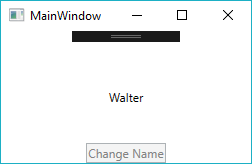
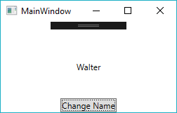
}运行我们的简单应用程序,我们可以看到单击按钮确实可以更改名称。
接下来,让我们返回并实现ICommand接口的CanExecute部分。
public class DelegateCommand : ICommand
{
    private readonly Action<object> _executeAction;
    private readonly Func<object, bool> _canExecuteAction;

    public DelegateCommand(Action<object> executeAction, Func<object, bool> canExecuteAction)
    {
        _executeAction = executeAction;
        _canExecuteAction = canExecuteAction;
    }

    public void Execute(object parameter) => _executeAction(parameter);

    public bool CanExecute(object parameter) => _canExecuteAction?.Invoke(parameter) ?? true;

    public event EventHandler CanExecuteChanged;

    public void InvokeCanExecuteChanged() => CanExecuteChanged?.Invoke(this, EventArgs.Empty);
}
与execute方法类似,此命令还将接受CanExecute委托。同样,CanExecuteChanged事件也使用公共方法公开,因此我们可以在CanExecute委托的返回值更改时随时提高它。
回到我们的视图模型中,我们将进行以下补充。
public ViewModel()
{
    _changeNameCommand = new DelegateCommand(OnChangeName, CanChangeName);
}

private void OnChangeName(object commandParameter)
{
    FirstName = "Walter";
    _changeNameCommand.InvokeCanExecuteChanged();
}

private bool CanChangeName(object commandParameter)
{
    return FirstName != "Walter";
}
调用CanChangeName以确定命令是否可以执行。在这种情况下,一旦名称更改为“ Walter”,我们将仅阻止命令执行。最后,在OnChangeName方法中更改名称后,该命令通过引发其事件来通知按钮其CanExecute状态已更改。
运行该应用程序,我们可以看到在更改名称后该按钮可以正确禁用。